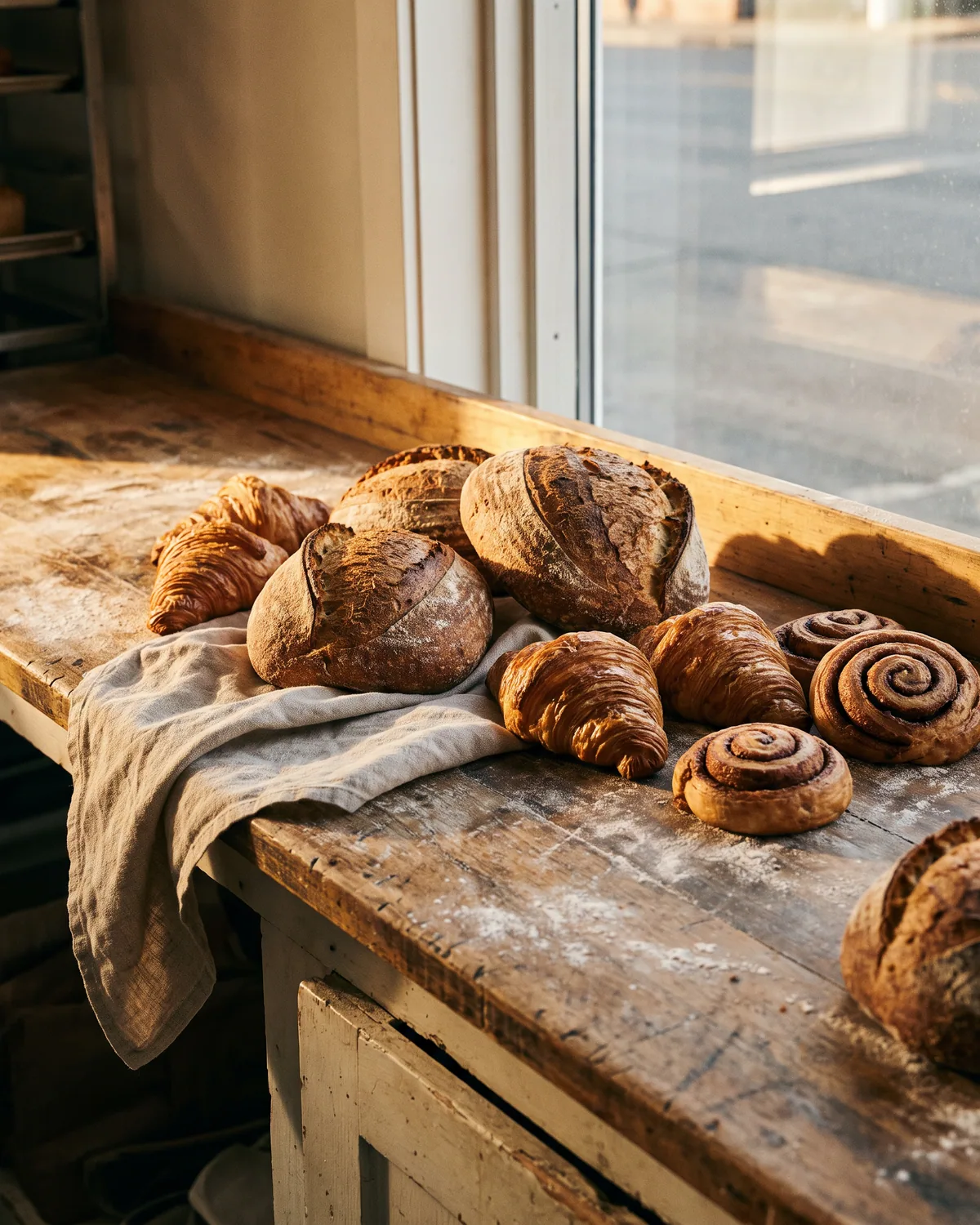
Loafing Otter Bakery
A neighbourhood bakery. A hand-drawn otter mark, rubber stamps, a bag, a box and a sign.
View project
A visual identity for an architecture bureau. The mark is a beam on a post: two lines and a module of air between them. Everything else stands on one grid and one typeface: the letterhead, the business card, the plaque by the entrance, a portfolio spread and the title block of a drawing.
Six sheets of one format: the mark, the grid, the letterhead, the plaque, the portfolio and the title block.
Six columns, margins and three sizes of text.
A narrow plaque by the entrance and its drawing with dimensions.
A spread: photos of the house and the model, captions on the grid.
The bureau’s corner block on a sheet: project, sheet, scale, date.
Brand & graphics2 of 4
A neighbourhood bakery. A hand-drawn otter mark, rubber stamps, a bag, a box and a sign.
Prefer a messenger?
Calgary